The Challenge
The owner of the publication approached us to design a responsive online platform for the publication, the newspaper was printed and distributed weekly in the Mackay, Whitsundays & the coal fields. They wanted to expand their reach and develop a digital platform.
The Deliverable
For this project, the main focus was on the UI part and on designing a responsive website. The aim was to follow the mobile-first approach to design a responsive platform for every device (Mobile, Desktop and Tablet).
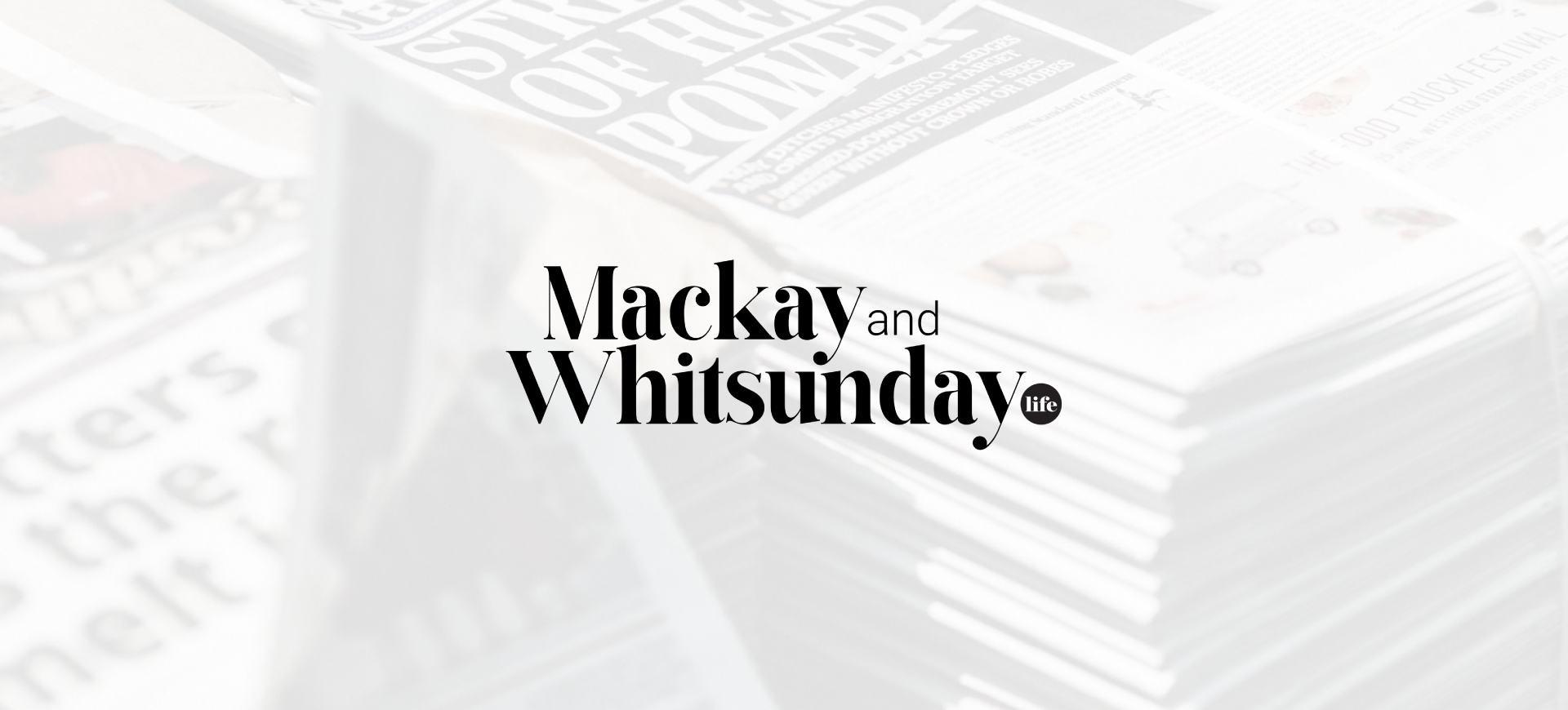
Client : Mackay & Whitsunday Life
Company : Digital Crayon
My Role : UX Research & UX/UI Designer
The Target Audience
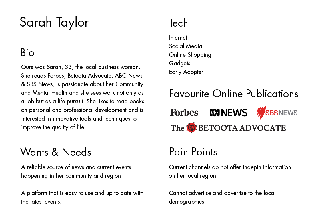
For this project, we had a given user persona. Ours was Sarah, 33, the ambitious business woman. She reads Forbes, Betoota Advocate, ABC News, is passionate about her Community and Mental Health and she sees work not only as a job but as a life pursuit. She likes to read books on personal and professional development and is interested in innovative tools and techniques to improve the quality of life.
User Interviews
In order to understand our user better, we had a look at the newspapers they read, how these look on different devices and what their information architecture is. We conducted user interviews. It consisted of asking people similar to our user persona to go on one of the competitors’ mobile website and perform a specific task. Observing them allowed us to see how they were interacting with the device and navigating throughout the site.
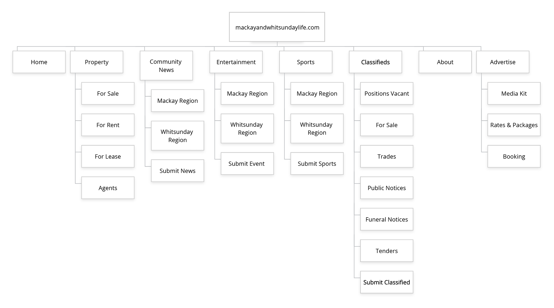
Sitemap
Based on user feedback, we developed our sitemap and included features for ‘Submitting Stories & Events’ and another one for businesses to purchase ‘Advertising space’. After doing some more testing, we also added an option for users to subscribe to receive a digital or print version of the magazine under ‘subscription’ on the top level navigation.
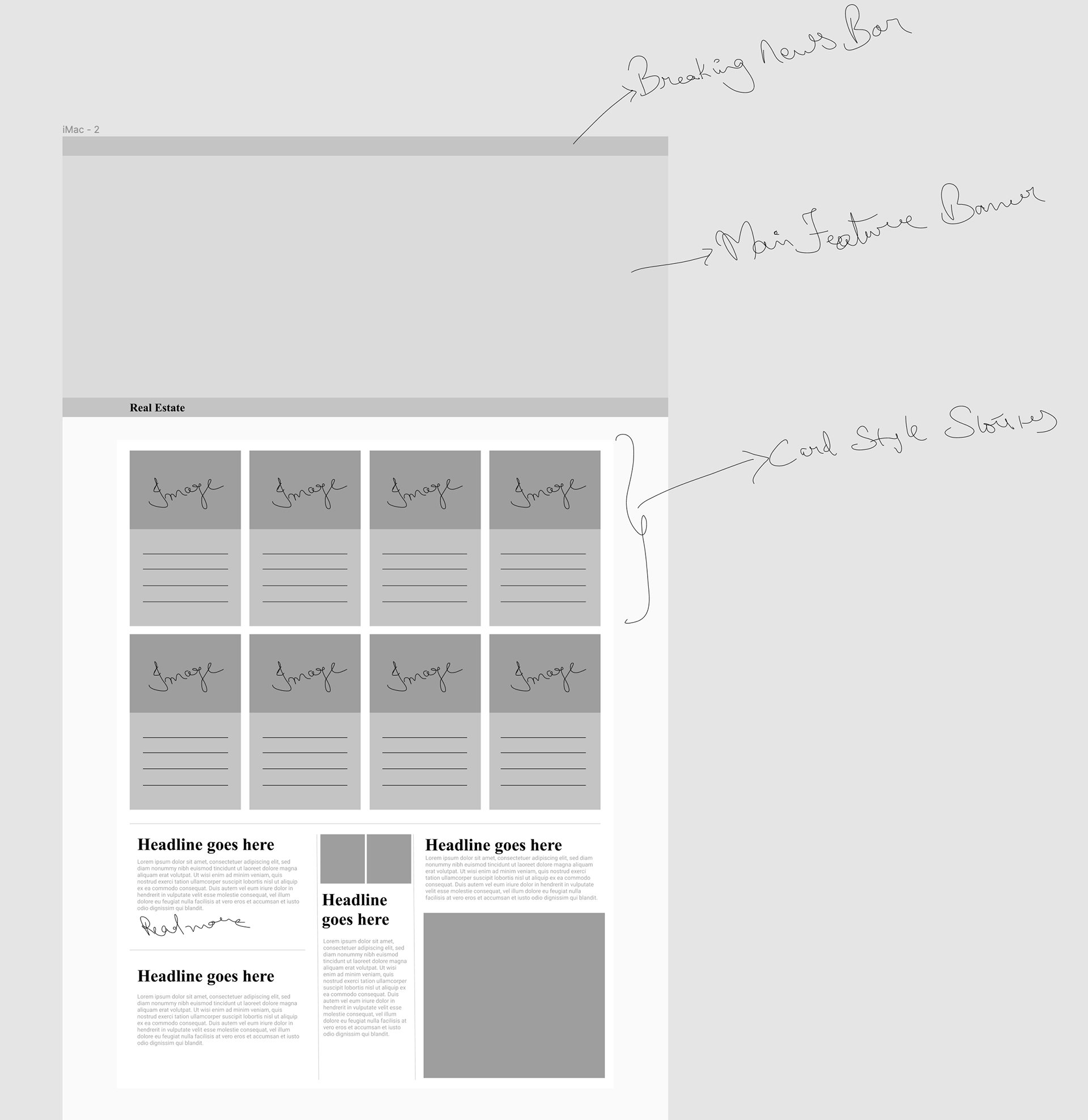
Wireframing
Keeping in mind the mobile-first approach, we started with wireframes. After testing our prototype, we made some changes based on testers’ & client feedback. Below are some snapshots of the prototyping stage.
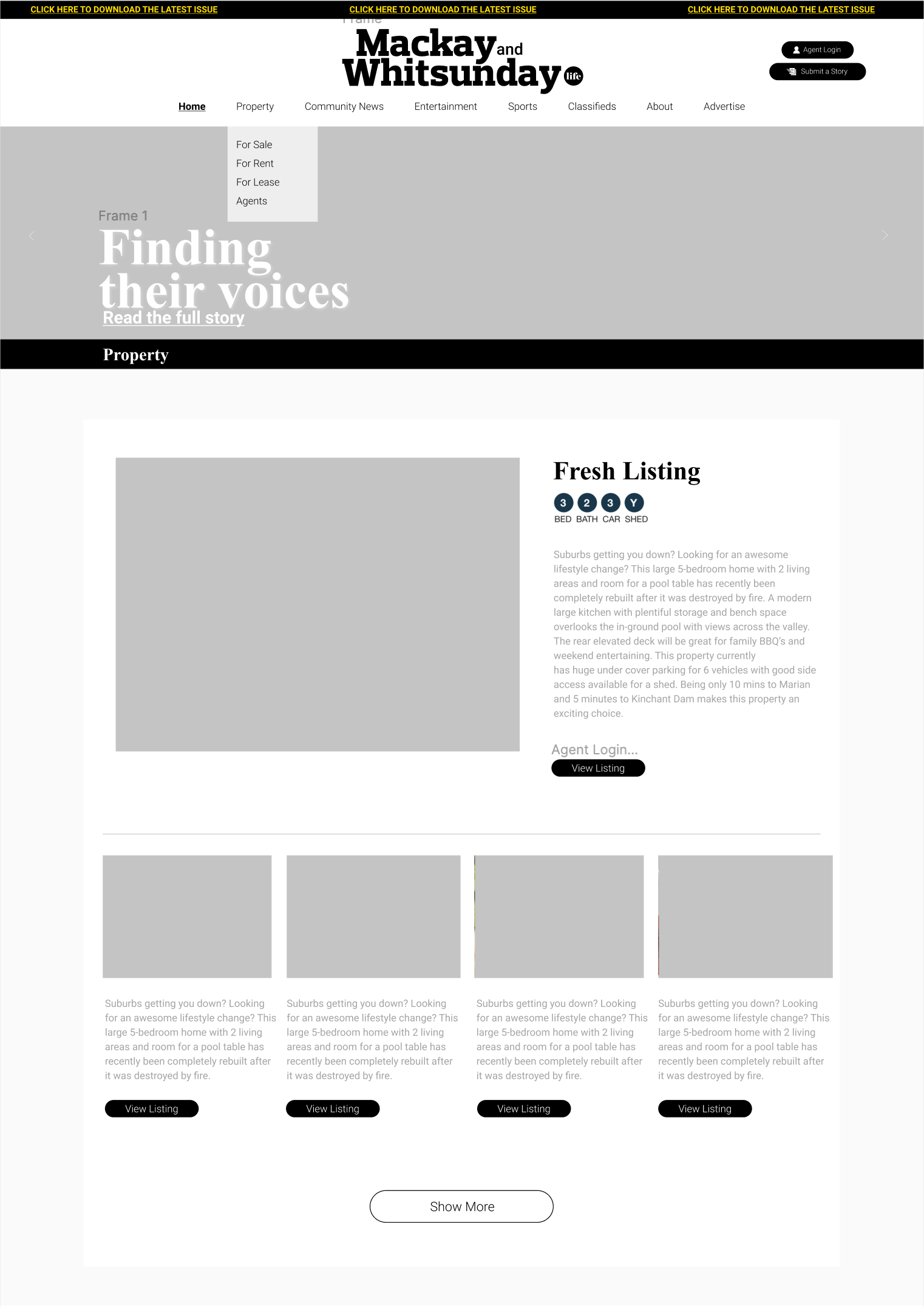
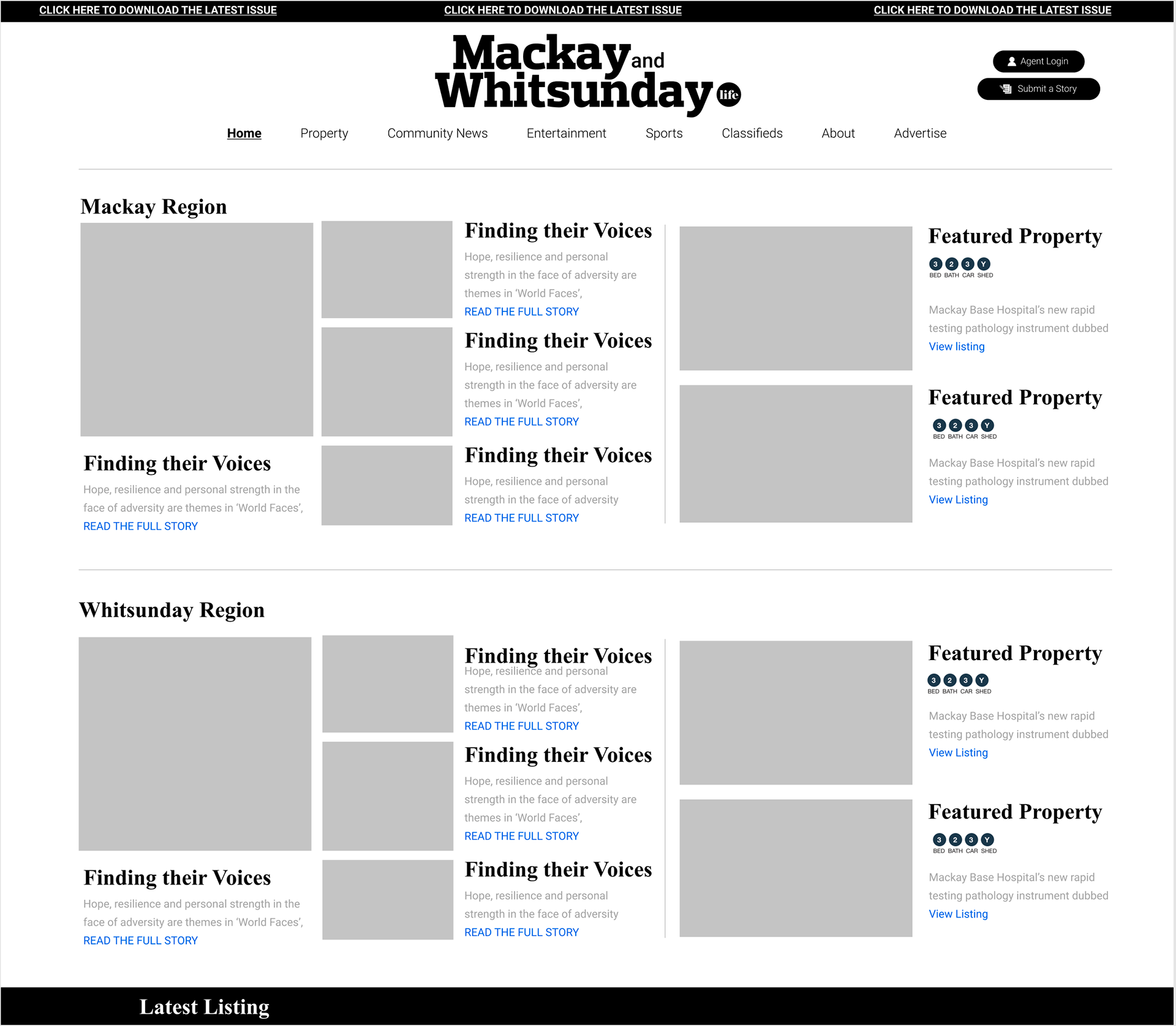
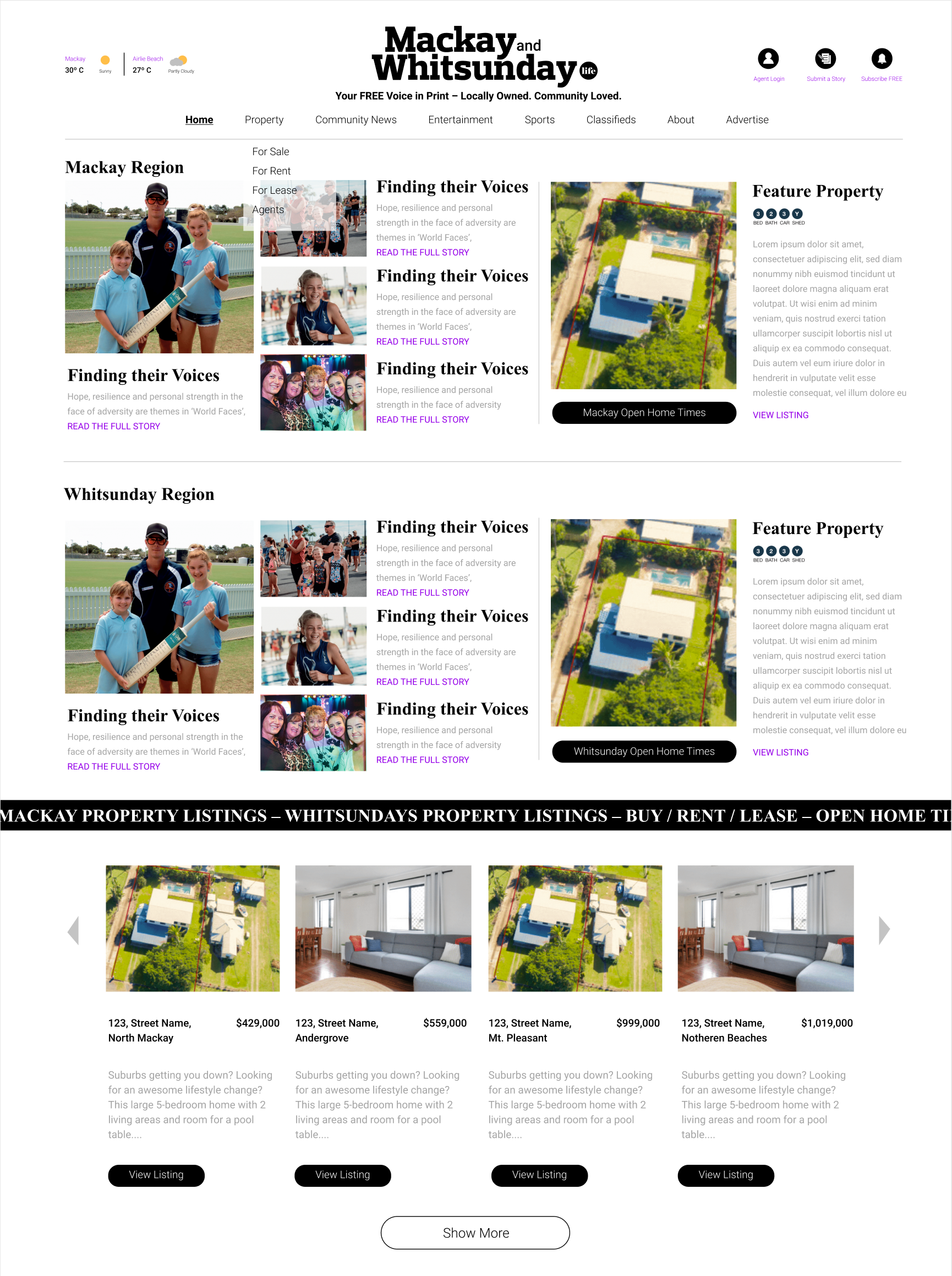
Hi-Fidelity Design
This part consisted in integrating our card style layout into our hi-fi layout. Following the mobile-first approach, we designed our hi-fi for desktop in a way that it easily translates to mobile devices without hampering user experience.
Desirability Testing
Based on the clients requirements we asked them to pick 5 adjectives to describe their brand. The words used to define the brand was informative, simple, straight-forward, community focused and cutting-edge.
As a personal experiment I conducted a desirability test to get an idea of how external people feel about the brand and website. This test was to not only identify feature improvements and new opportunities but also confirm that the product design aligned with the business & user expectations.
I showed them three different websites, (Wired, Huff Post and Vice) in PDF format and deleted the newspapers’ names so they wouldn’t get influenced at all. Interviewees were given 30 adjectives and had to select, for each website, five that best describe the website. Below were some of the most used words by users.
Clean, Familiar, Easy to use, Informative, Well thought-out, User friendly, Modern and Personable.
To view the live website, please visit
Website development by Digital Crayon for Core Life Publishing (mackayandwhitsundaylife.com)