About the Project
This case study on a job search app Hyrd is a documentation of a group project undertaken during the Experience Design immersive course at Griffith University, Queensland. The Group consisted of Gigi Lapid, Samantha Pereira and Myself.
The case study covers UX Research ( User Interviews, Heuristic Evaluation, User Personas, User Flow, Competitive Analysis), Interface and Interaction Design with Adobe XD followed by Usability testing.
The Brief
The brief was to work in a team of three and identify problems/opportunities with an existing mobile application and apply the UX design methodology to revamp the app. My Team decided to build a new app from ground up.
Our Methodology
With a time frame of 2 weeks, We broke the UX sprint into research, synthesis, prototype and testing.
Research Phase
With job seekers in mind, the group developed a set of questions that would enable them to profoundly empathise with the users. The researchers specifically tailored the questions to apply to job seekers who had experienced using job apps.
The two key questions were:
1) How might the communication gap between job seekers and companies/recruiters be addressed?
2) How might job seekers be able to present themselves more effectively and authentically via job apps?
These were then further expounded into two sets of questions: one for an online survey and another, to be utilised for both user interviews and focus group discussions.
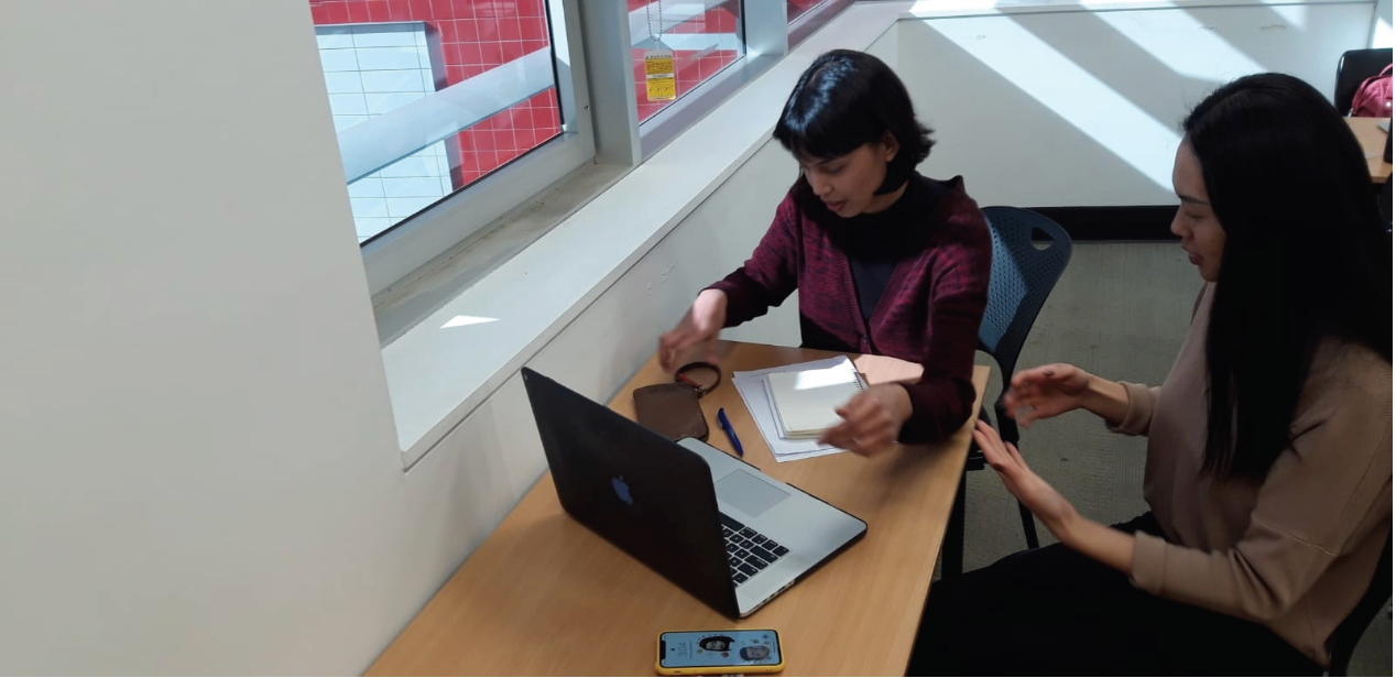
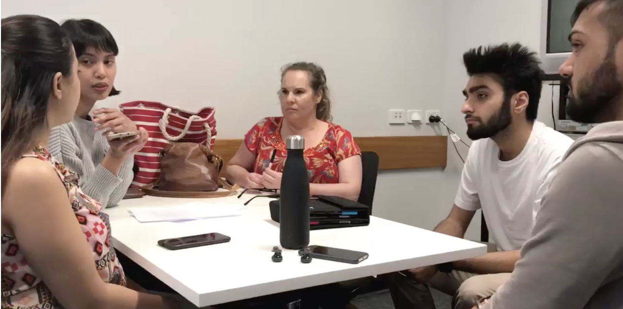
User Research
We followed up with user interviews to understand motivations, user behaviour and pain points of using the app. We conducted 3 interviews, online survey with 20 participants & 3 focus group meetings to know more about how job seekers search and apply when looking for job opportunities.
Research Findings
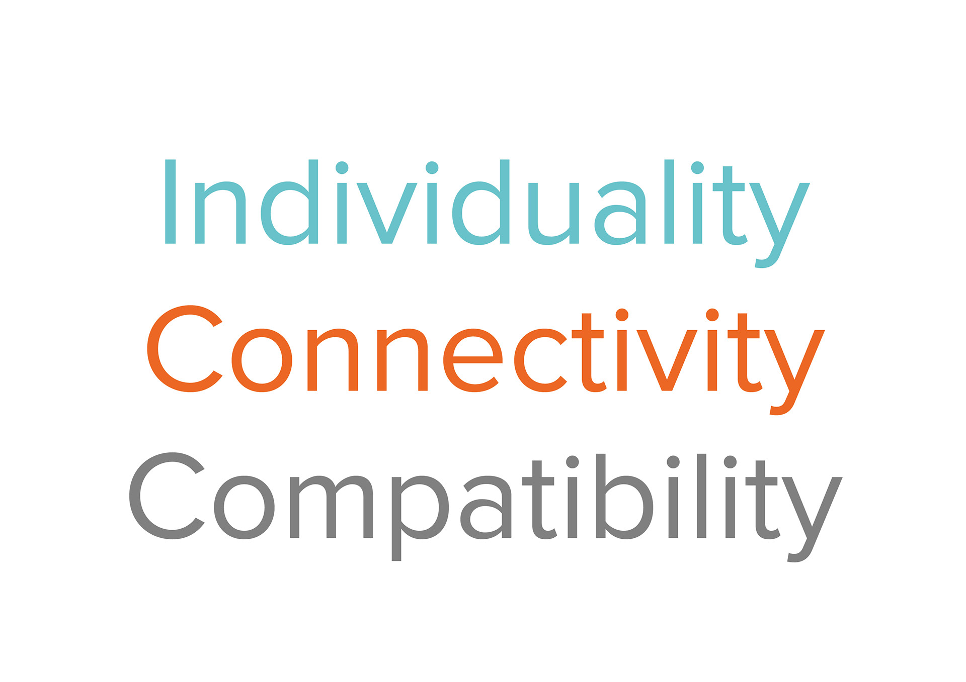
After organising and analysing the data, the we were able to identify three central themes that revolve around the users’ pain points and needs:
1) Individuality
2) Connectivity
3) Compatibility
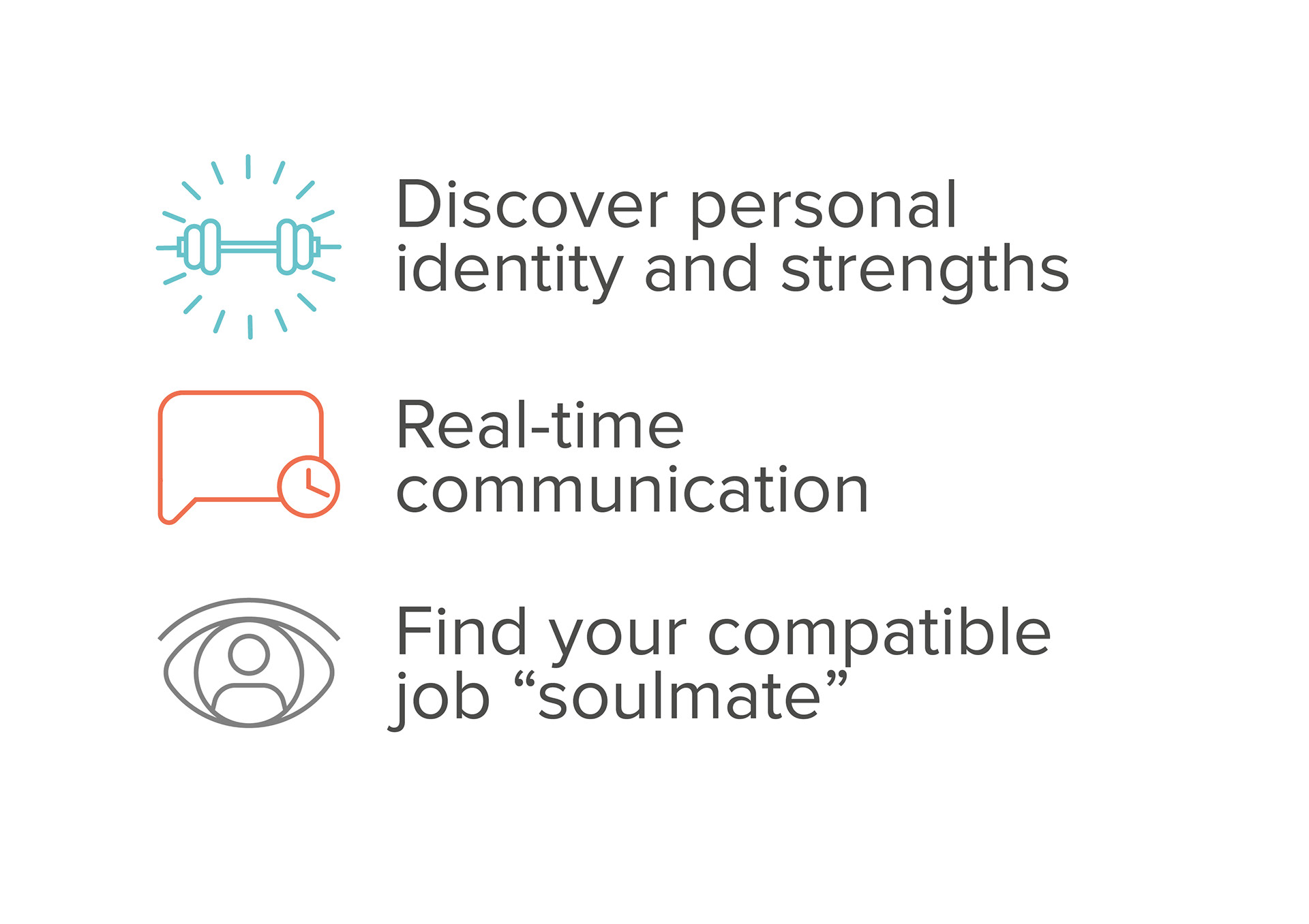
Implications for
the Concept
To maximise communication between job seekers and employers that would cut the wait time and enable more real-time updates and interactions. These findings have given us a better insight into users’ needs and how they might address them creatively. The best approach for this is to build on the users’ strengths and enable them to step out of comfort zone by being more in-control (in terms of communicating directly with companies), creative and human-centric with their job applications and job searches. The aim is to get to represent themselves more authentically so employers and recruiters easily spot their potential and view their interests.
Problem Statement
Based on all the research findings we defined the problem statement as
" To maximise communication between job seekers and employers that would cut the wait time and enable more real-time updates and interactions".
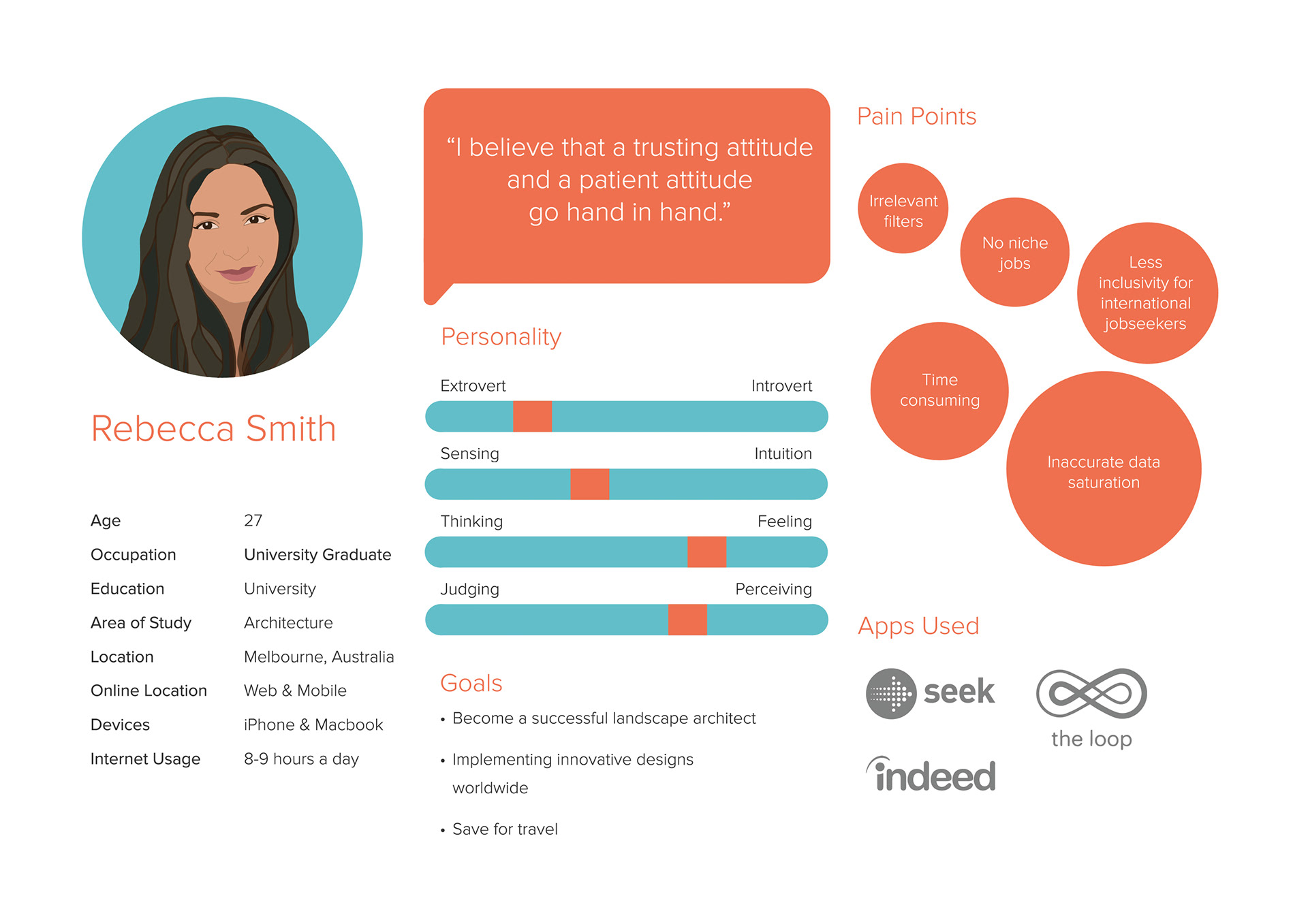
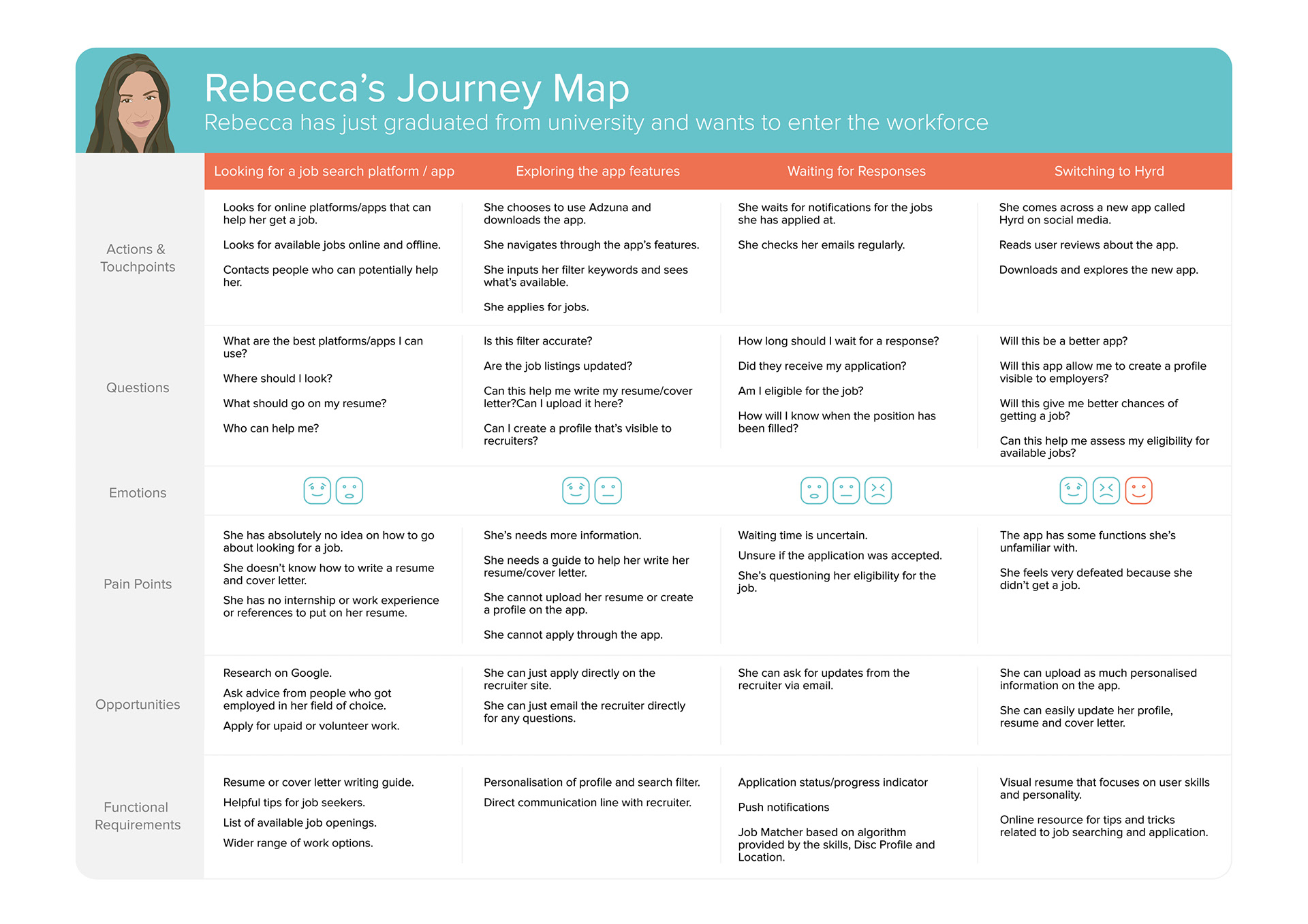
User Persona &
Journey Map
Based on the user interviews, we came up with three main personas below is an example of one of the personas.
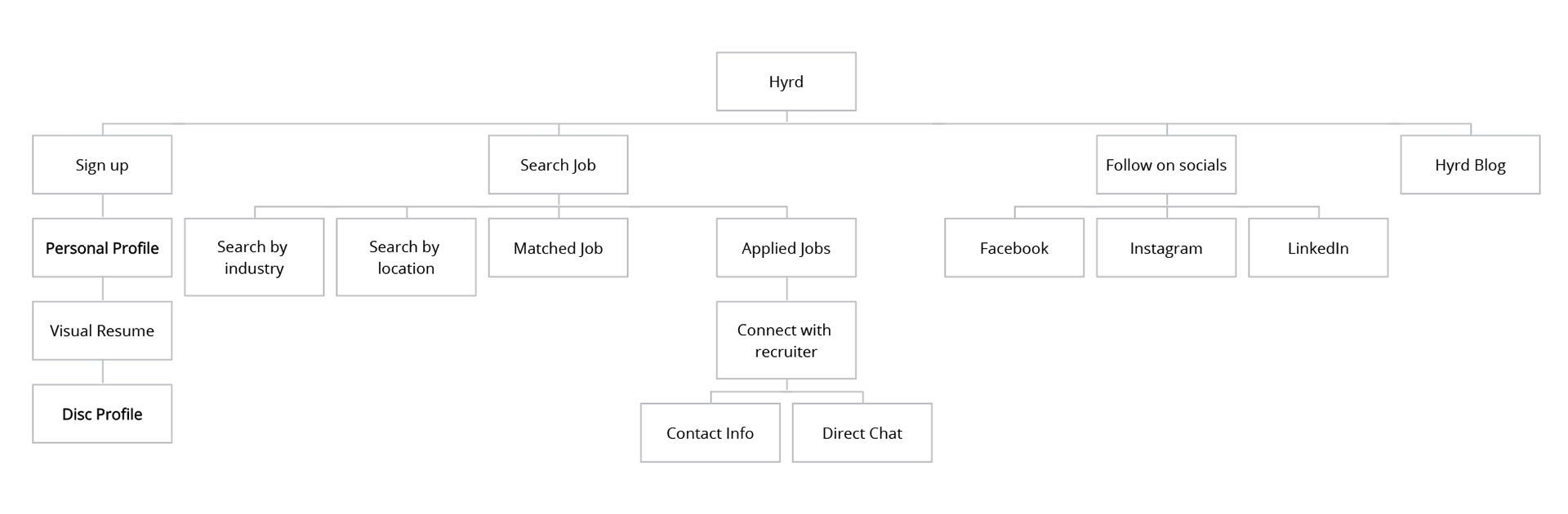
Information Architecture
.
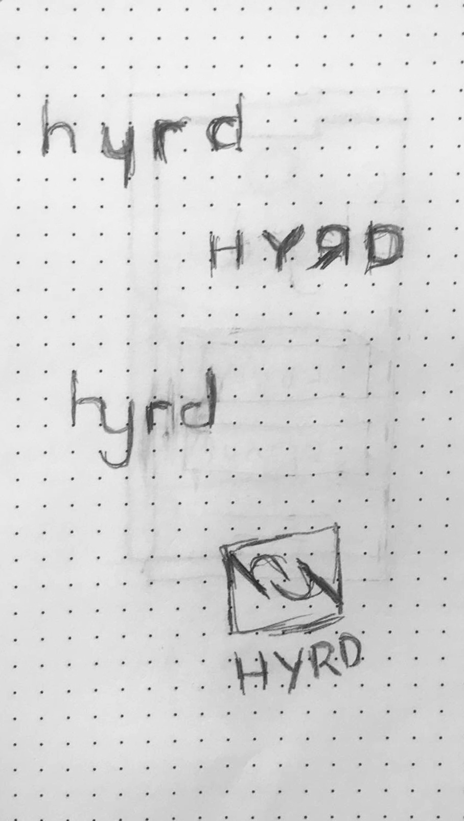
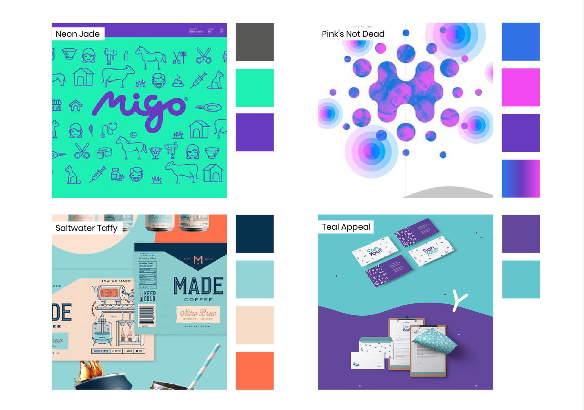
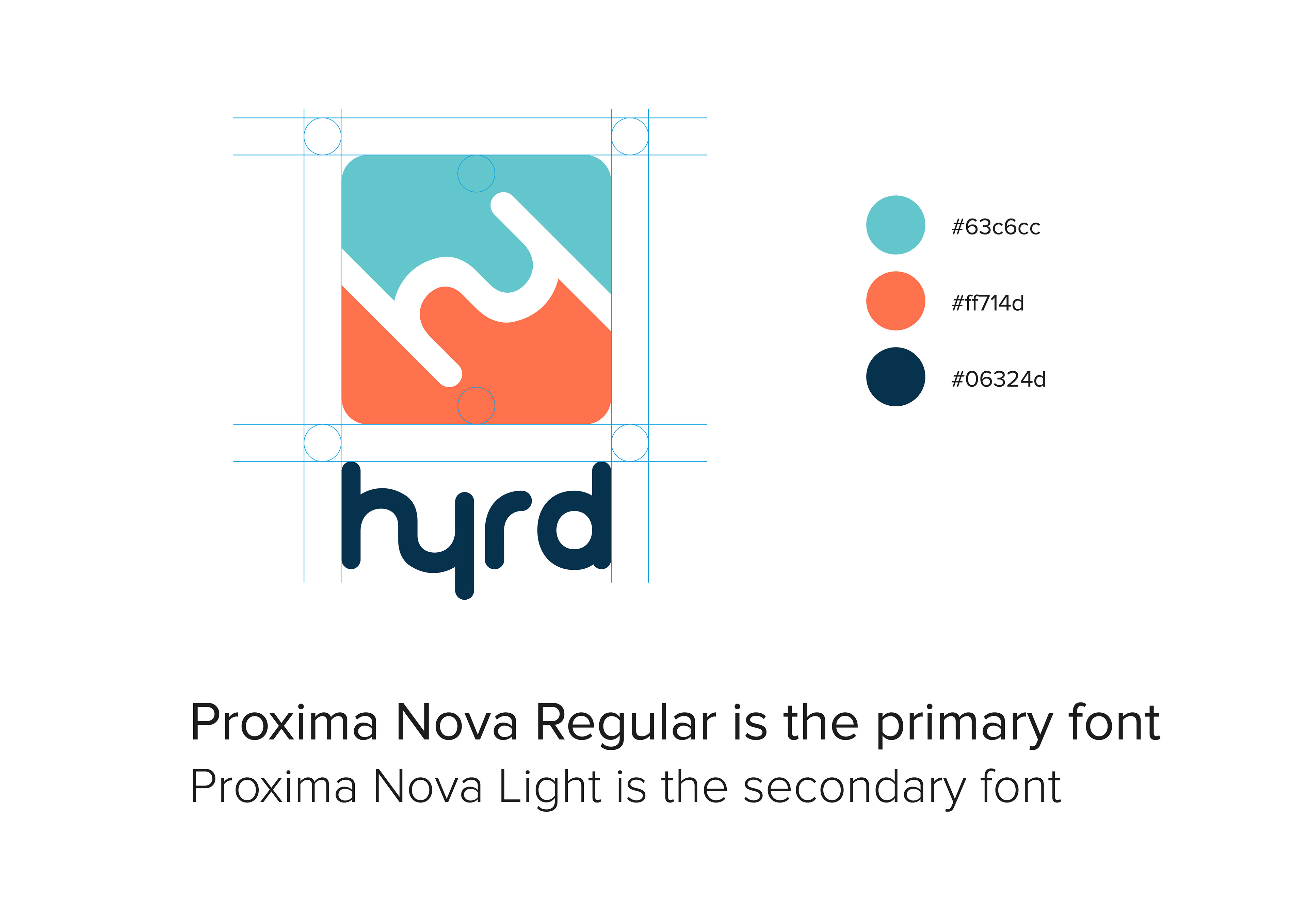
Brand Development
.
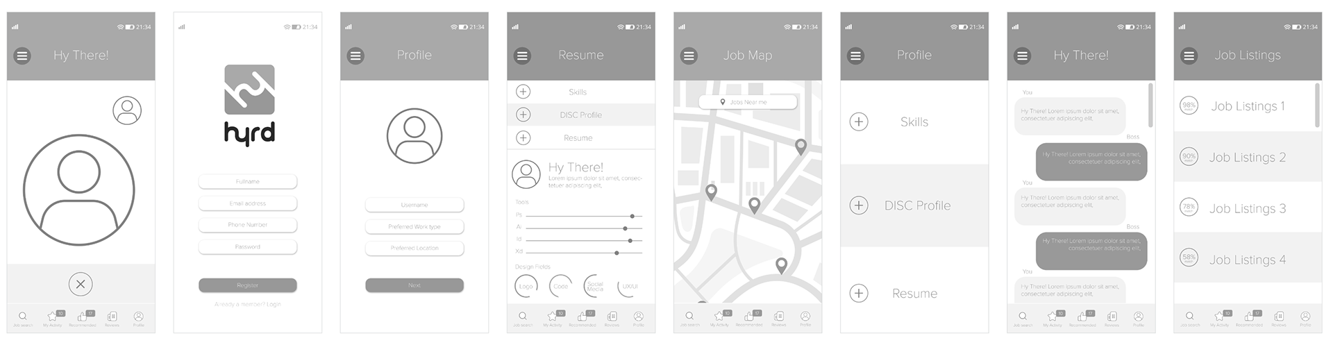
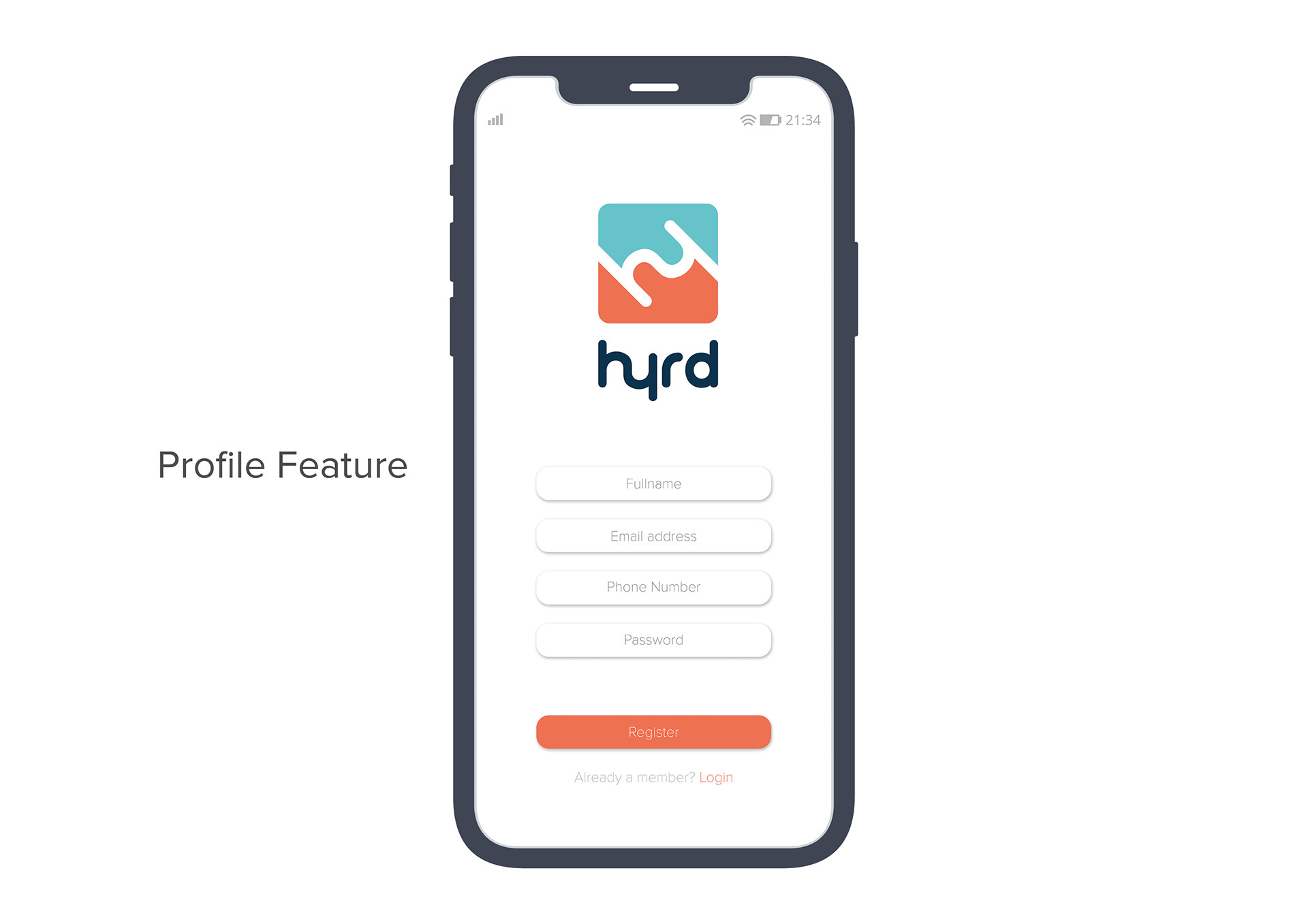
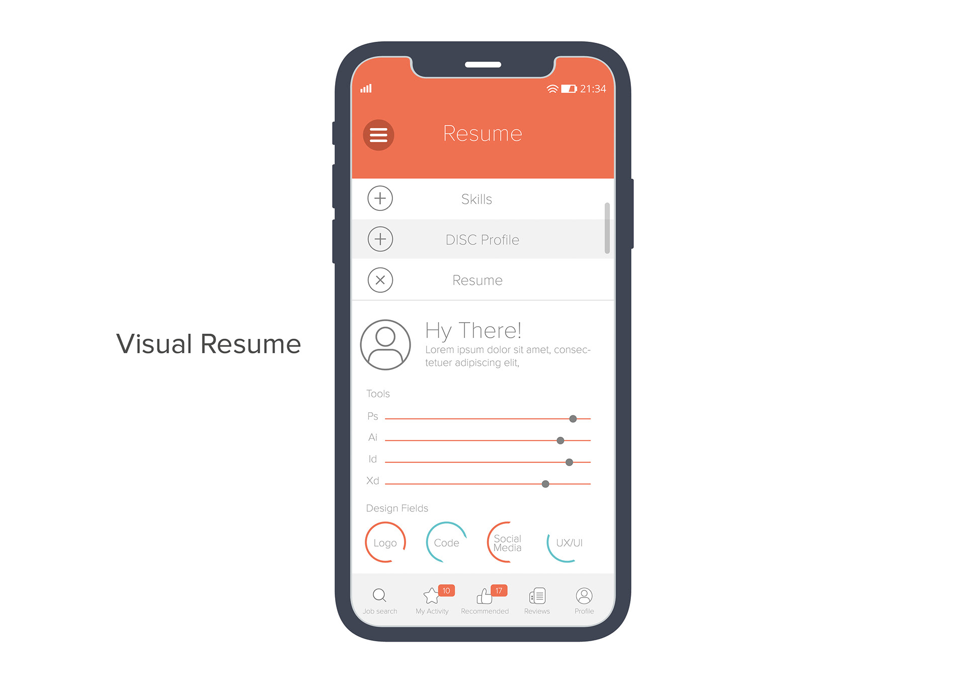
LoFi Prototype
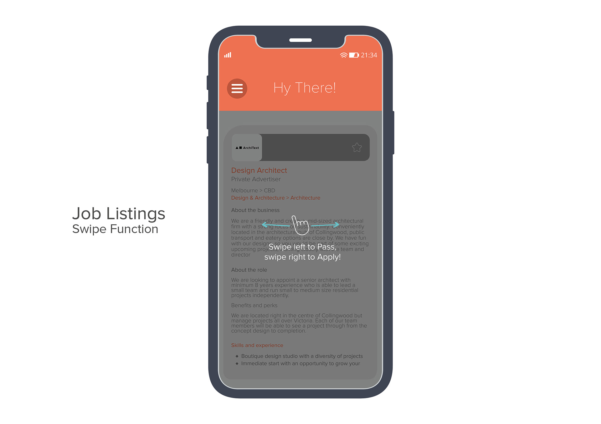
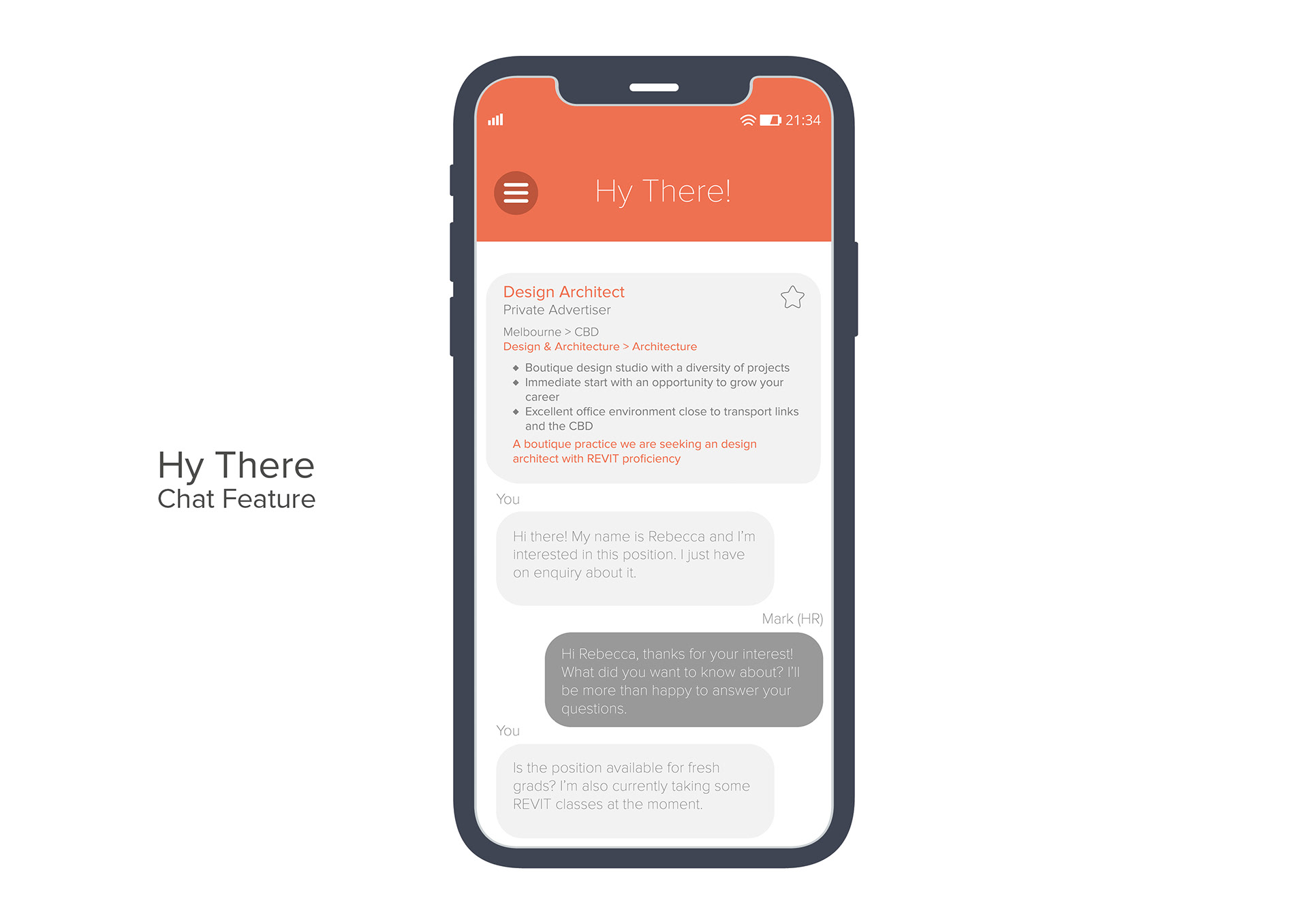
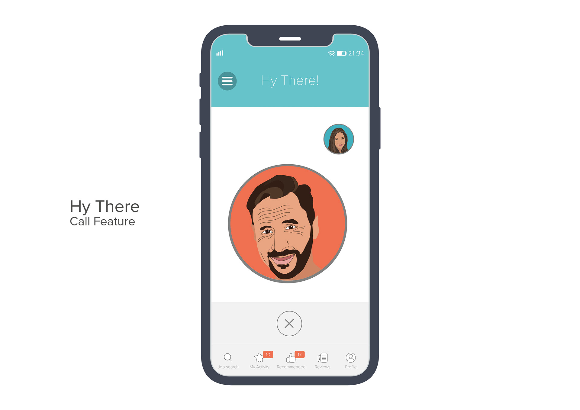
The app contains 30+ screens that includes— the Job Seeker and the recruiter side which contains creating job posts, applicant screening & video interview feature. We prototyped the wireframes during the mid-fidelity stage and did a usability test before moving to the hi-fidelity.
Key Learnings
This project helped me to get a deeper understanding of user personas and explore different research methods to get a better understanding of user motivations, behaviour, needs and goals.
In terms of design, we would also relook at some design elements to consider designing for accessibility. A key take away from this project was to keep in mind designing for accessibility and having come from a branding & marketing design background I have a found deep interest in this topic.